You know that feeling when you land on a website and immediately think:
“Something feels off.”
You probably can’t explain it.
The logo looks fine.
The colours aren’t terrible.
The photos are decent.
The website works.
There isn’t some giant technical disaster staring you in the face.
But you still wouldn’t buy from the company.
You’d probably open another tab.
That’s the interesting part about website trust.
People rarely tell you exactly why they don’t trust your website.
They just leave.
And if you’re a business owner, that’s a much bigger problem than having an ugly website.
A professional-looking website isn’t automatically a trustworthy website
This is where a lot of businesses get stuck.
They redesign their website.
New colours.
New typography.
Better animations.
A fancy hero section.
Maybe even some 3D graphics because apparently every modern website needs them now.
Then they launch it and wonder why nothing really changed.
Because looking professional and being believable are two different things.
Research from Stanford’s Web Credibility Project found that visual design played a major role in how people evaluated website credibility. But the same research also points to other things that matter: showing a real organisation, demonstrating expertise, making contact easy, keeping information useful and current, and avoiding errors.
In other words:
Good design can get you taken seriously.
It can’t do all the work of proving you’re worth trusting.
Think about how you judge businesses online
Imagine you’re looking for an interior designer.
You find two companies.
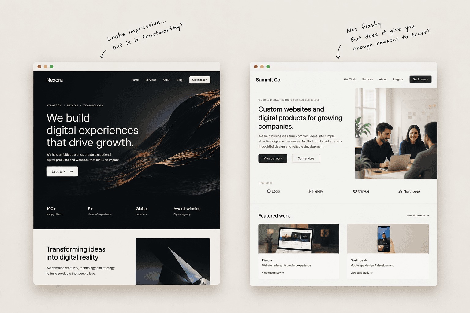
The first has a beautiful website.
Perfect photography.
Smooth animations.
Big statements about “transforming spaces.”
But you can’t find:
- who runs the company
- where they’re based
- what projects they’ve actually completed
- how the process works
- what happens after you contact them
The second website isn’t nearly as impressive.
But it shows real projects.
Real people.
Clear services.
A proper address.
Client testimonials.
A straightforward explanation of how the process works.
Which one are you more likely to contact?
Probably the second.
That’s because trust isn’t created by polish alone.
It’s created when the website gives you enough reasons to stop being suspicious.
Your visitors are quietly checking for red flags
Nobody sits there with a checklist saying:
“Let me evaluate this company’s credibility.”
They don’t need to.
People make these judgments almost automatically.
Is the website current?
Does this business seem real?
Are there actual people behind it?
Do they understand what they’re talking about?
Can I find evidence?
Can I contact them?
Does anything look strangely unfinished?
Does the company sound like a real company or like someone fed a bunch of corporate phrases into a generator?
These little signals add up.
And so do the bad ones.
A broken link here.
An outdated copyright year there.
A stock photo of a smiling “team” that clearly isn’t their team.
A testimonial with no name.
A phone number buried at the bottom.
A page promising “world-class solutions” without explaining what the company actually does.
None of these things necessarily kills a sale on its own.
Together, they create doubt.
And doubt is expensive.
The biggest trust problem might be your own copy
This one gets ignored.
A website can look excellent and still sound completely unbelievable.
Consider:
“We empower businesses with innovative, scalable, end-to-end digital solutions that drive transformational growth.”
What does that actually tell you?
Almost nothing.
Now compare it with:
“We design and build websites for companies that have outgrown their old one.”
Much less impressive.
Much more useful.
Good website copy doesn’t constantly try to convince people that you’re exceptional.
It gives them enough information to decide that for themselves.
Specific beats impressive.
Instead of:
“Industry-leading expertise.”
Say what you actually know.
Instead of:
“Customer-centric solutions.”
Explain what working with you actually looks like.
Instead of:
“We deliver excellence.”
Show the work.
People don’t trust claims because they’re written in large type.
They trust evidence.
Show me the work
This sounds obvious, but businesses are surprisingly bad at it.
A company says it has 12 years of experience.
Okay.
Show me what that experience produced.
A consultant says they’ve helped 200 businesses.
Show me examples.
An agency says it creates “high-converting websites.”
Show me some websites.
A manufacturer says its products are trusted by major companies.
Show me who uses them, where appropriate.
This is one reason case studies are so valuable.
A case study isn’t just a place to say:
“Client was happy. We did a great job.”
That’s useless.
A useful case study tells me:
What was wrong?
What needed to change?
What did you actually do?
What changed afterwards?
The story becomes evidence.
And evidence is much harder to fake than adjectives.
Real people still matter
There’s another reason some websites feel strangely suspicious.
You can’t find anyone.
The company has a logo.
It has a fancy mission statement.
It has “Our Story.”
But where are the humans?
Stanford’s credibility guidelines specifically recommend showing that there is a real organisation and real people behind a website, alongside clear contact information and evidence of expertise.
This doesn’t mean every website needs a giant “Meet Our Amazing Team” section with twelve corporate headshots.
It means the visitor shouldn’t feel like they’re dealing with a mysterious internet entity.
Show the founder if that matters.
Show the team if the team is part of the value.
Explain where you’re based.
Give people a legitimate way to reach you.
Make the business feel like a business.
Not a landing page floating somewhere on the internet.
Your website should answer the uncomfortable questions
Good marketing tends to answer the questions businesses wish customers wouldn’t ask.
How much does this cost?
How long will it take?
What happens if something goes wrong?
Who exactly is doing the work?
Have you done this before?
What happens after I contact you?
Why should I choose you instead of someone else?
You don’t necessarily need to publish every answer on the homepage.
But if your website avoids every uncomfortable question, people notice.
And they’ll often find the answers somewhere else.
Usually from a competitor.
Don’t confuse “premium” with “expensive-looking”
This is another trap.
Businesses often want their website to feel premium.
So everything gets bigger.
More whitespace.
Bigger typography.
Minimal navigation.
Huge photography.
Elegant animations.
Suddenly the website looks like a luxury fashion brand.
Except the business sells industrial equipment.
Or accounting services.
Or medical software.
Or commercial logistics.
The problem isn’t that minimal design is bad.
The problem is that design has to match the expectation you’re creating.
Stanford’s credibility research makes a similar point: a site should look professional or appropriate for its purpose, rather than simply copying whatever currently looks fashionable.
A website selling a ₹20,000 service and a website selling a ₹20 lakh service shouldn’t necessarily communicate value in exactly the same way.
“Premium” isn’t a visual style.
It’s a perception of value, confidence and relevance.
One weirdly small detail can ruin everything
This is why website credibility can be frustrating.
You can spend months getting the big things right and then lose trust because of something tiny.
A typo.
A button that doesn’t work.
A contact form that never responds.
An outdated testimonial.
A stock image that appears on fifty other websites.
A “recent” blog post from 2021.
A footer that still says “© 2023.”
Stanford’s credibility guidelines explicitly call out errors, broken links and outdated content as things that can damage credibility.
And honestly, this makes sense.
If a business can’t keep its own website working, why would I assume it will handle my project carefully?
That’s not necessarily fair.
But customers aren’t required to be fair.
They’re required to make decisions with limited information.
Your website is part of that information.
The website is not the product
This is probably the biggest misunderstanding.
Businesses sometimes treat the website like a trophy.
Something to show people.
Something to make competitors jealous of.
Something that looks good when the founder shares it on LinkedIn.
But your customer doesn’t care how difficult your website was to build.
They care whether it helps them answer:
“Should I work with this company?”
That changes how you design almost everything.
Your homepage doesn’t need to tell your entire company history.
It needs to establish relevance.
Your services page doesn’t need 900 words of corporate language.
It needs to explain what you actually do.
Your case studies don’t need to sound like award submissions.
They need to show what happened.
Your contact page doesn’t need to be clever.
It needs to make contacting you easy.
Good websites aren’t necessarily impressive.
They’re reassuring.
A simple test for your own website
Open your website as if you’ve never seen the business before.
Then forget that you know everything about it.
Give yourself 60 seconds.
Can you answer these questions?
What does this company actually do?
Who is it for?
Why should I believe them?
Can I see evidence?
Can I find a real person or real organisation behind it?
What happens if I want to work with them?
What should I do next?
If you can’t answer most of those questions quickly, adding another animation probably isn’t going to fix the problem.
Neither is changing the button colour.
And definitely not another “revolutionary digital solutions” headline.
The problem is probably deeper.
Trust isn’t something you add at the end
The best websites don’t have a “trust section.”
Trust is built into the whole experience.
It’s in the way the company explains itself.
It’s in the quality of the work shown.
It’s in the details.
It’s in the people.
It’s in the writing.
It’s in how easy it is to find an answer.
It’s in whether the website feels like someone actually cares about what happens after the visitor clicks Contact.
That’s why redesigning a website isn’t really about making an old website prettier.
Sometimes it is.
But often, the real job is figuring out:
What does someone need to believe before they’re willing to take the next step?
Then designing the website around that.
Because people don’t hire companies because their websites have nice gradients.
They hire them when the website gives them enough confidence to say:
“Yeah. These people seem to know what they’re doing.”
That’s the job.
Not looking impressive.
Looking believable.