
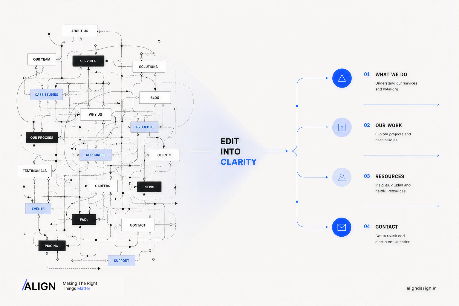
Your website probably has too many things to say.
Not too little.
Look at a typical business website and you’ll often find a familiar pattern:
A navigation bar with five or six items.
A hero section with two CTAs.
A row of services.
A section about the company.
Another section about why the company is different.
Testimonials.
Case studies.
A newsletter.
A contact form.
And somewhere in between all of that, the visitor is expected to figure out what actually matters.
When a website like this underperforms, the usual response is to redesign the navigation.
Maybe the menu needs to be cleaner.
Maybe the CTA needs to be bigger.
Maybe there should be a hamburger menu.
Maybe the important pages should be moved into the header.
Sometimes those changes help.
But often, they’re treating the symptom.
The real problem is hierarchy.
If everything is presented as important, the user has to do the work of deciding what matters.
And that’s not good UX.
Navigation is the visible part of a much bigger decision
A navigation menu is only the final expression of an information structure.
Before deciding whether a website should have:
- Services
- Solutions
- Products
- Industries
- Resources
- About
- Contact
you need to answer a more uncomfortable question:
What does the visitor actually need to understand?
That’s information architecture.
It’s the invisible structure underneath the interface—the relationship between pages, content, categories, actions and information.
When that structure is weak, designers often compensate visually.
More dropdowns.
More buttons.
More labels.
More cards.
More links.
The interface becomes increasingly helpful-looking while becoming increasingly difficult to understand.
Baymard’s research into ecommerce navigation illustrates how common this problem is. Its 2025 benchmark found that 58% of desktop ecommerce sites and 67% of mobile sites had mediocre-to-poor homepage and category-navigation performance.
That’s not a problem that can be solved by making the menu prettier.
It’s a structural problem.
The “mega menu” isn’t automatically good navigation
There’s a common assumption in web design:
If there is a lot of content, expose more of it.
It sounds logical.
But exposing everything isn’t the same as making everything findable.
Imagine an agency website with six services.
You could put all six in the navigation.
Then add sub-services.
Then industries.
Then resources.
Then case studies.
Then links to specific project pages.
Technically, the visitor has access to everything.
But they now have to process everything.
That’s the distinction between availability and clarity.
A website can make information available while still making it difficult to understand.
Baymard’s ecommerce research repeatedly points toward the importance of making category structures understandable and keeping navigation aligned with how people actually look for things. In its research, users encountered hundreds of usability problems while navigating even large, established ecommerce sites.
The lesson isn’t “make smaller menus.”
It’s:
Don’t make users decode your organisational system before they can use your website.
Start with what the user is trying to do
A company’s internal structure rarely makes a good website structure.
This is where many websites go wrong.
A company might think about itself like this:
Company
→ Departments
→ Services
→ Capabilities
→ Processes
→ Resources
But the visitor doesn’t necessarily think that way.
They might arrive thinking:
“I need a website.”
Or:
“I want to compare these two products.”
Or:
“Can you solve this particular problem?”
Or simply:
“Who are these people, and can I trust them?”
Those are different mental models.
Good website navigation bridges the gap between the company’s internal organisation and the user’s mental model.
That’s why labels like “What We Do”, “Solutions”, or “Capabilities” aren’t automatically useful.
They may make perfect sense internally.
But if the visitor is looking for a specific service, a vague category can create unnecessary interpretation.
Sometimes the clearest navigation label is simply the thing itself.
Web Design.
Branding.
Pricing.
Products.
About.
Clarity isn’t boring when it removes a decision.
Your homepage should not make every argument at once
This is where hierarchy becomes even more important.
A homepage isn’t supposed to contain everything the company has ever wanted to say.
Its job is to establish enough context for the visitor to decide where to go next.
That means the homepage should answer questions in roughly the order the visitor needs them.
1. What is this?
The visitor should understand the basic proposition quickly.
2. Is this relevant to me?
The content should help them recognise whether the offering fits their situation.
3. Why should I care?
This is where value, differentiation, outcomes or relevant proof become useful.
4. What can I do next?
The interface should provide a clear path forward.
Notice what’s missing:
“How do we fit every possible piece of information onto the homepage?”
That’s not the objective.
Baymard’s research also describes the homepage as a navigational anchor and emphasises that it needs to help users pursue different product-finding paths rather than simply functioning as a promotional billboard.
A homepage should create orientation before it creates complexity.
The easiest way to test your hierarchy
Here’s a simple exercise.
Take your homepage and remove the visual styling.
No colours.
No images.
No animations.
No fancy typography.
No cards.
No gradients.
Just the headings, labels, links and buttons.
Now read it from top to bottom.
Ask:
Can I understand what this company does?
Then:
Can I understand who it is for?
Then:
Can I identify the most important action?
Then:
Can I predict where each major link will take me?
If the answer is no, visual polish isn’t going to save it.
You have an information problem.
And information problems should be solved with information architecture before they’re solved with UI.
A useful rule: every level needs a job
Good hierarchy isn’t just about making one heading larger than another.
It’s about giving each layer of information a different responsibility.
For example:
Page
What is this page about?
Section
What part of the subject are we dealing with?
Heading
What specific idea is being introduced?
Body copy
What does the visitor need to know?
CTA
What can they do next?
When these levels start competing, the page becomes noisy.
A section heading starts behaving like a CTA.
A CTA starts trying to explain the entire service.
A paragraph starts carrying information that should have been communicated through the heading.
A card contains another card containing another card.
At that point, the problem isn’t a lack of design.
It’s that the content has no clear hierarchy.
More choices can make a website feel less useful
This is particularly obvious in ecommerce.
Imagine you’re looking for running shoes.
You arrive at a category page and see:
Running Shoes
Then:
- Road Running
- Trail Running
- Racing
- Training
- Lifestyle
- New Arrivals
- Best Sellers
- Men’s
- Women’s
- Neutral
- Stability
- Lightweight
- Cushioned
None of these categories are inherently bad.
But collectively, they can become a classification problem.
Which one should you choose first?
This is why filtering, categorisation and navigation cannot be treated as isolated interface components.
Baymard’s research into product-list UX found that sites with mediocre product-list usability saw abandonment rates of 67–90% in its testing, compared with 17–33% for sites with a slightly optimised toolset.
The important part isn’t the exact numbers.
It’s the underlying lesson:
Users don’t experience navigation, filtering and content structure as separate design exercises.
They experience one journey.
The best navigation often feels almost boring
This is one of the stranger things about good UX.
When navigation works, nobody compliments the navigation.
Nobody says:
“What an incredible dropdown.”
They simply find what they came for.
That’s the point.
Good navigation reduces the amount of thinking required to move through a website.
Not because users shouldn’t think.
Because they shouldn’t have to think about the interface itself.
They should be thinking about the thing they came to the website for.
A good product page makes the product easier to evaluate.
A good service page makes the service easier to understand.
A good navigation system makes the website easier to move through.
The design disappears into the experience.
Before redesigning the menu, fix these five things
If a website feels difficult to navigate, don’t immediately redesign the header.
Start here.
01 — Remove duplicate destinations
If three different labels lead to essentially the same place, you probably don’t have three navigation options.
You have one unclear one.
02 — Rename vague categories
Ask whether a first-time visitor would understand what a label means without knowing the company’s internal terminology.
If not, simplify it.
03 — Group related information
If users have to jump between unrelated sections to complete one task, your information architecture may be fragmented.
04 — Decide what’s actually important
Not every page deserves equal prominence.
Hierarchy requires prioritisation.
05 — Test the structure before polishing it
Create a simple sitemap or low-fidelity wireframe.
Give someone a task.
Then watch where they go.
If they consistently choose the wrong path, don’t blame the user.
Your structure may be communicating the wrong thing.
The uncomfortable part: sometimes you need to delete things
This is where redesigns become difficult.
Adding is easy.
Deleting requires decisions.
If every service is “important,” every case study is “important,” every announcement is “important,” and every CTA is “important,” then the website has no hierarchy.
The visitor gets the full archive instead of the useful path.
Good digital design often involves saying:
This doesn’t need to be here.
Not because the information is bad.
Because it isn’t useful at this moment.
That’s a much harder decision than choosing a font or rearranging a grid.
But it’s also where better websites are usually made.
The real job of navigation isn’t to show people where everything is
It’s to help them understand where they should go next.
That distinction changes how you approach an entire website.
Instead of asking:
“What pages should we put in the menu?”
ask:
“What decisions does the visitor need to make?”
Instead of:
“How can we fit more information on the homepage?”
ask:
“What does the visitor need to understand before they can move forward?”
Instead of:
“Can we add another CTA?”
ask:
“Is the current CTA actually the right next step?”
The interface becomes simpler because the thinking underneath it becomes clearer.
And that’s usually the part people don’t see.
Good navigation isn’t about giving users more directions.
It’s about making the right direction easier to recognise.
When the hierarchy is right, the menu doesn’t need to work so hard.
The page doesn’t need to explain everything.
And the user doesn’t need to fight their way through the website to find the thing they came for.
That’s what good UX should feel like.
Not impressive. Just obvious.
Looking to make something clearer?
Explore ALIGN →
