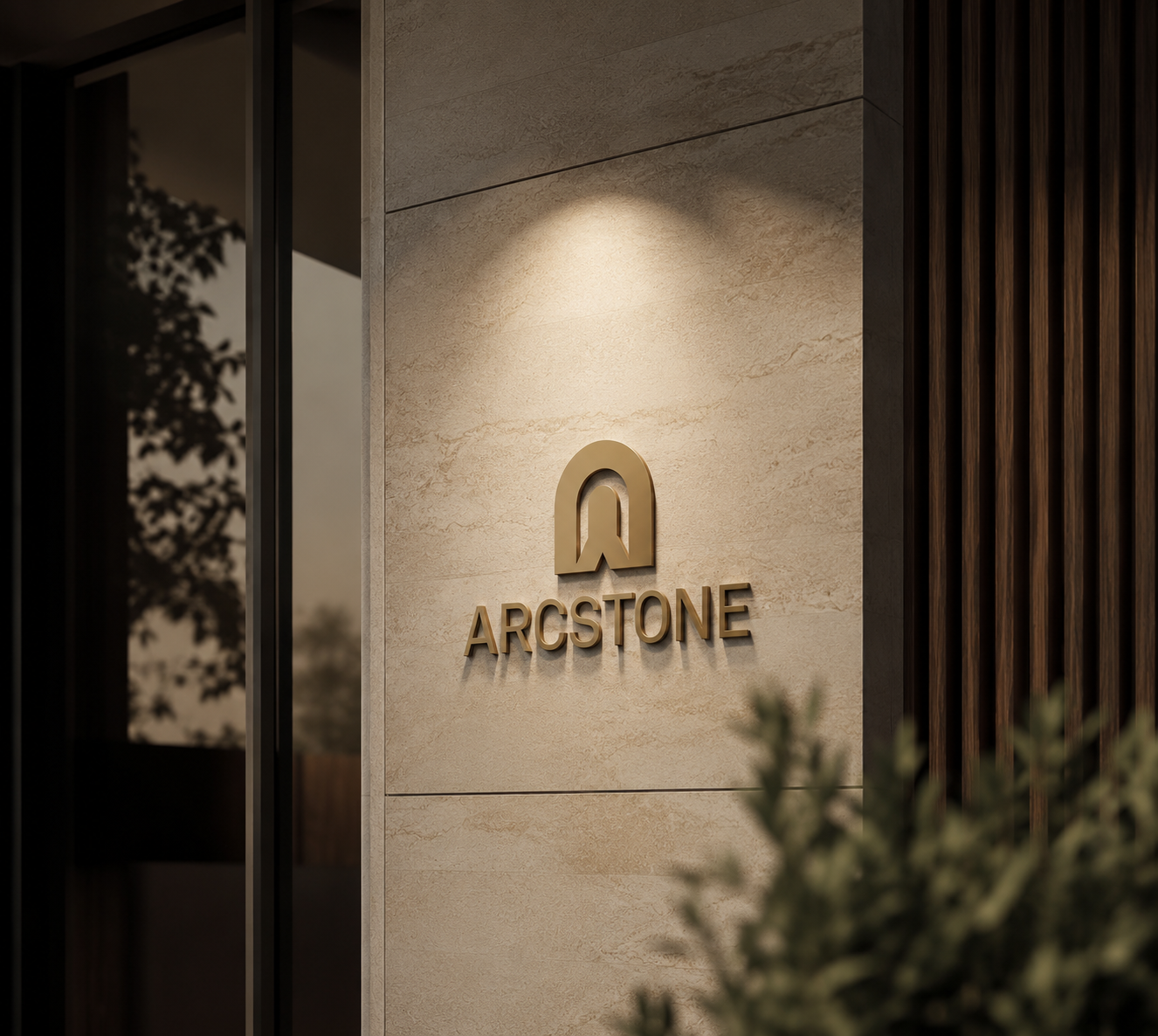
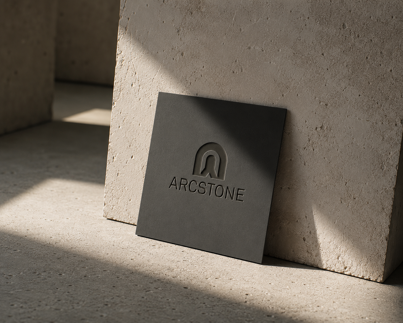
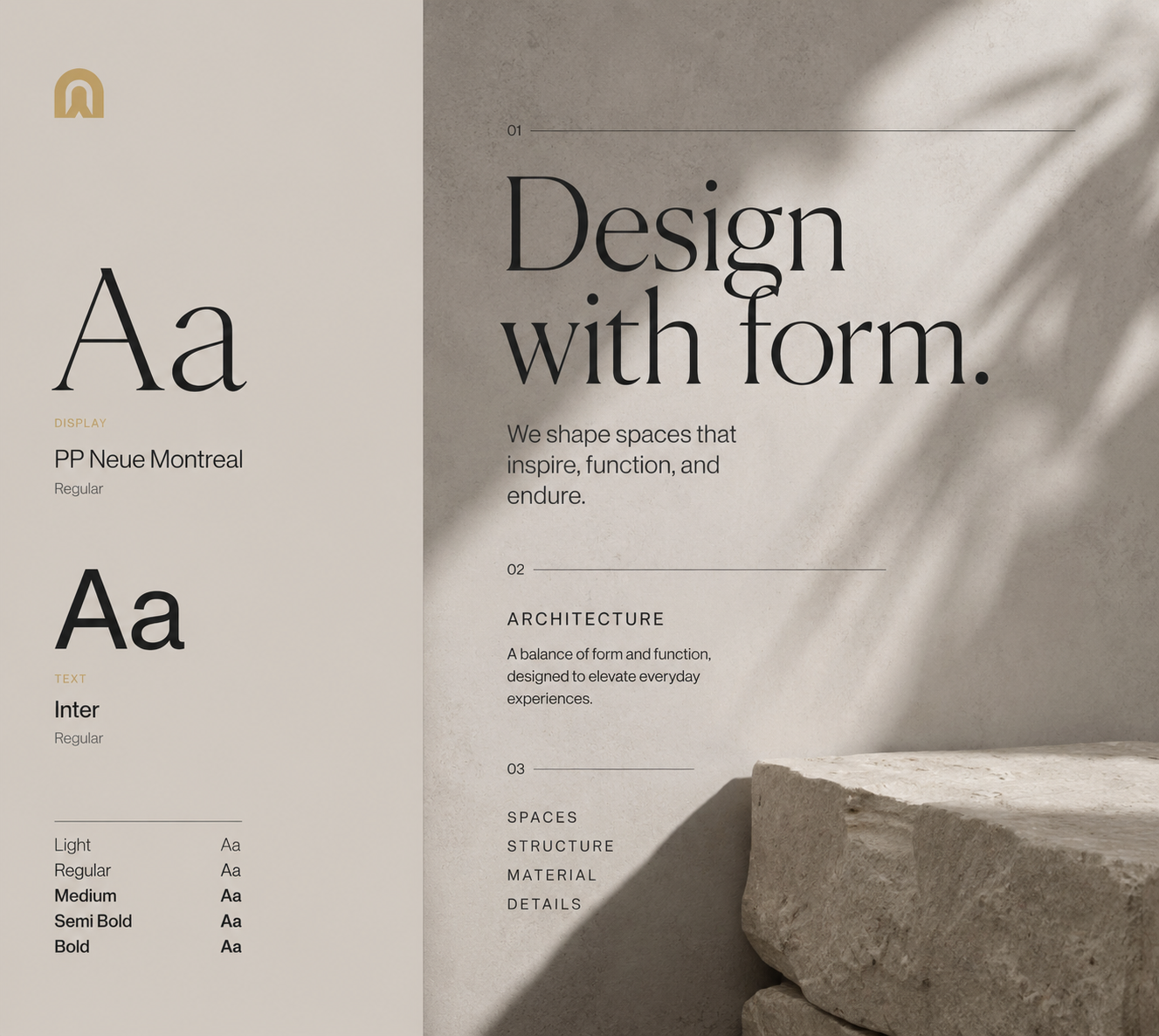
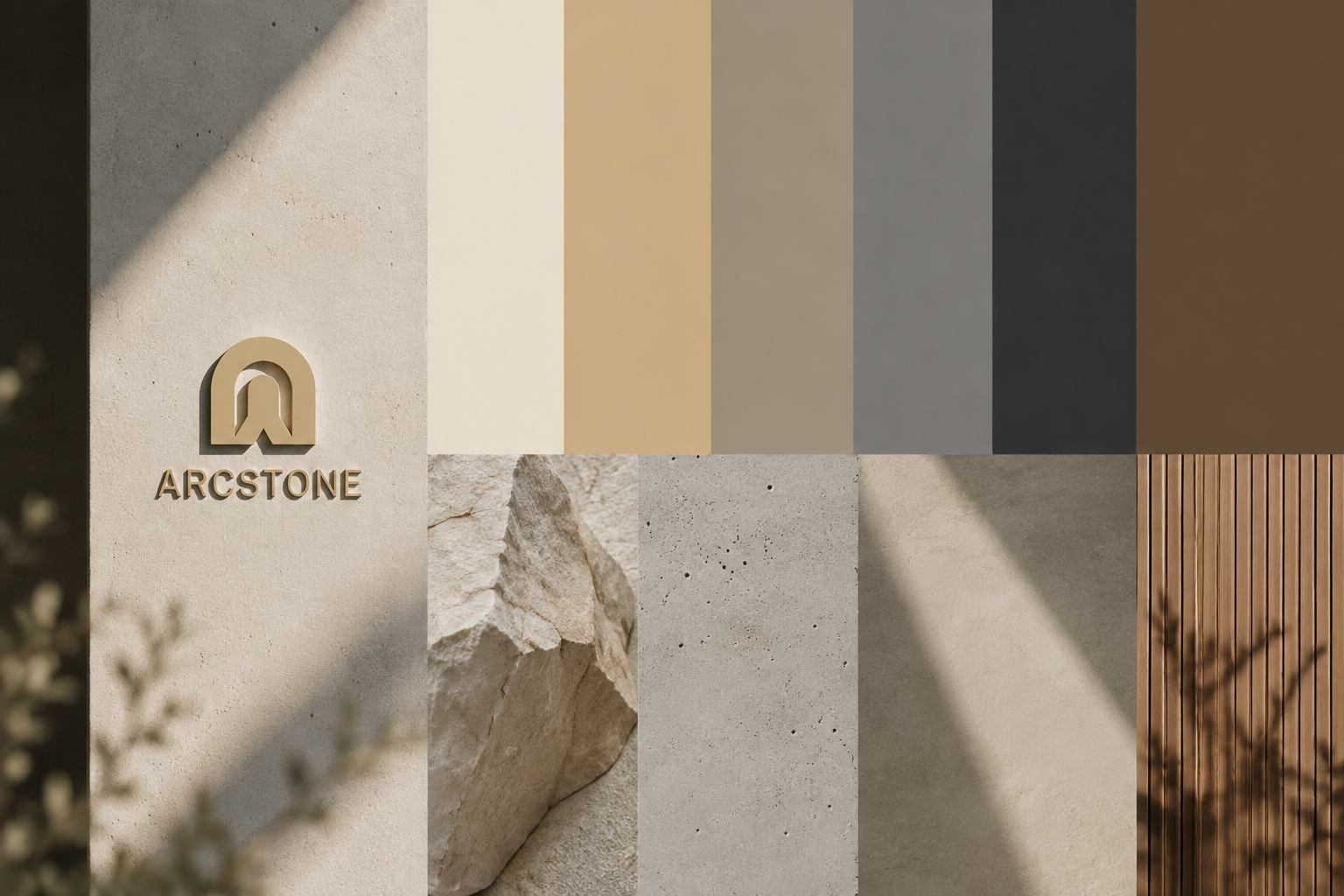
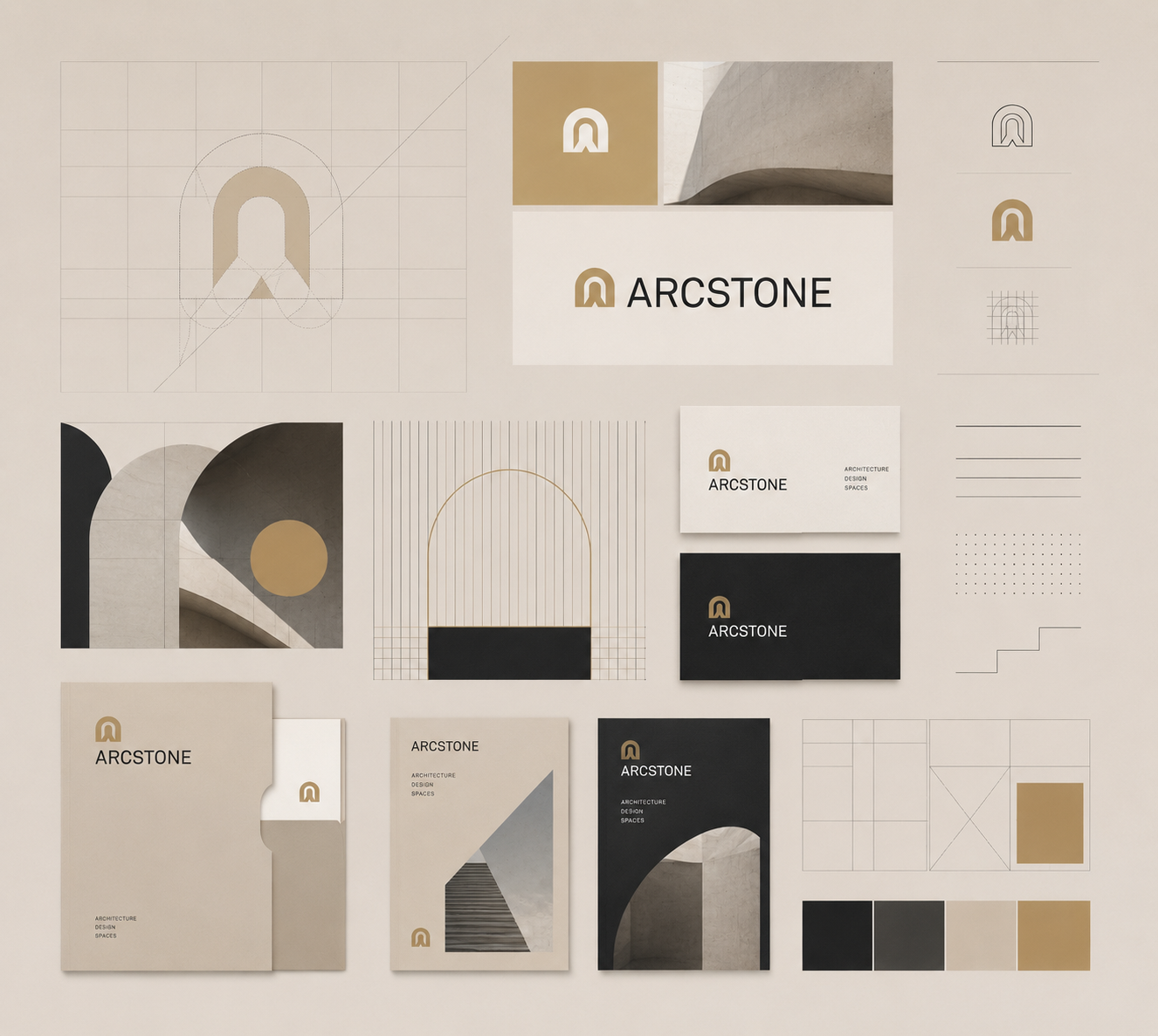
Arcstone is a contemporary architectural brand built around structure, material, and thoughtful design. The identity creates a refined, timeless presence through a considered mix of typography, colour, and visual elements.
A refined identity for an architectural studio shaped by structure, material, and thoughtful design.
Client
Arcstone
Industry
Architecture
Our work
Brand Identity · Visual System
Scope
Concept Project
THE CHALLENGE
BUILDING AN IDENTITY WITH A SENSE OF PLACE.
Arcstone needed a visual identity that could reflect the same qualities found in good architecture structure, balance, material, and attention to detail. “The challenge was to create something refined without making it feel cold or overly minimal.”
THE DIRECTION
LESS DECORATION. MORE STRUCTURE.
The identity was built around the idea that strong design doesn’t need to be loud. It needs proportion, purpose, and restraint.
1
STRUCTURE
A visual system built on balance, proportion, and clear geometry.
2
MATERIAL
Textures and imagery bring warmth and a sense of physicality to the identity.
3
PRECISION
Typography, spacing, and composition are carefully controlled to create a refined feel.
4
TIMELESSNESS
A restrained visual language designed to remain relevant beyond trends.
THE IDENTITY
A SYSTEM BUILT ON FORM.
The Arcstone identity takes cues from architecture itself — structure, proportion, material, and space. Every element is designed to work together as one considered visual system, creating a brand that feels refined without becoming predictable.
Geometric forms, grids, and considered compositions create a flexible visual language across touchpoints.
THE OUTCOME
A BRAND WITH ROOM TO BUILD.
The result is a flexible identity that gives Arcstone a stronger foundation for presenting its work, communicating its approach, and building recognition over time.
STRUCTURED
A clear visual system with a strong underlying grid.
DISTINCTIVE
A refined identity that avoids predictable architectural branding.
FLEXIBLE
A system designed to work across projects, presentations, print, and digital.
BRAND IN USE
FROM DRAWING BOARD TO EVERYDAY TOUCHPOINT.
The identity was designed to move naturally across presentations, project documentation, stationery, and digital touchpoints—keeping Arcstone recognisable without restricting how the brand can grow.
Architectural presentation
Large presentation/document mockup.
Project documentation
Architectural plans, project sheets, proposals.
Business stationery
Cards, letterheads, folders.
THE TAKEAWAY
GOOD ARCHITECTURE STARTS WITH STRUCTURE.SO DOES GOOD BRANDING.
The goal wasn’t to make Arcstone look “architectural.” It was to build an identity that shared the qualities of good architecture — considered, structured, purposeful, and built to last.
Whether you’re building a new brand, rethinking an existing one, or starting with nothing but an idea — let’s give it the direction it deserves.