
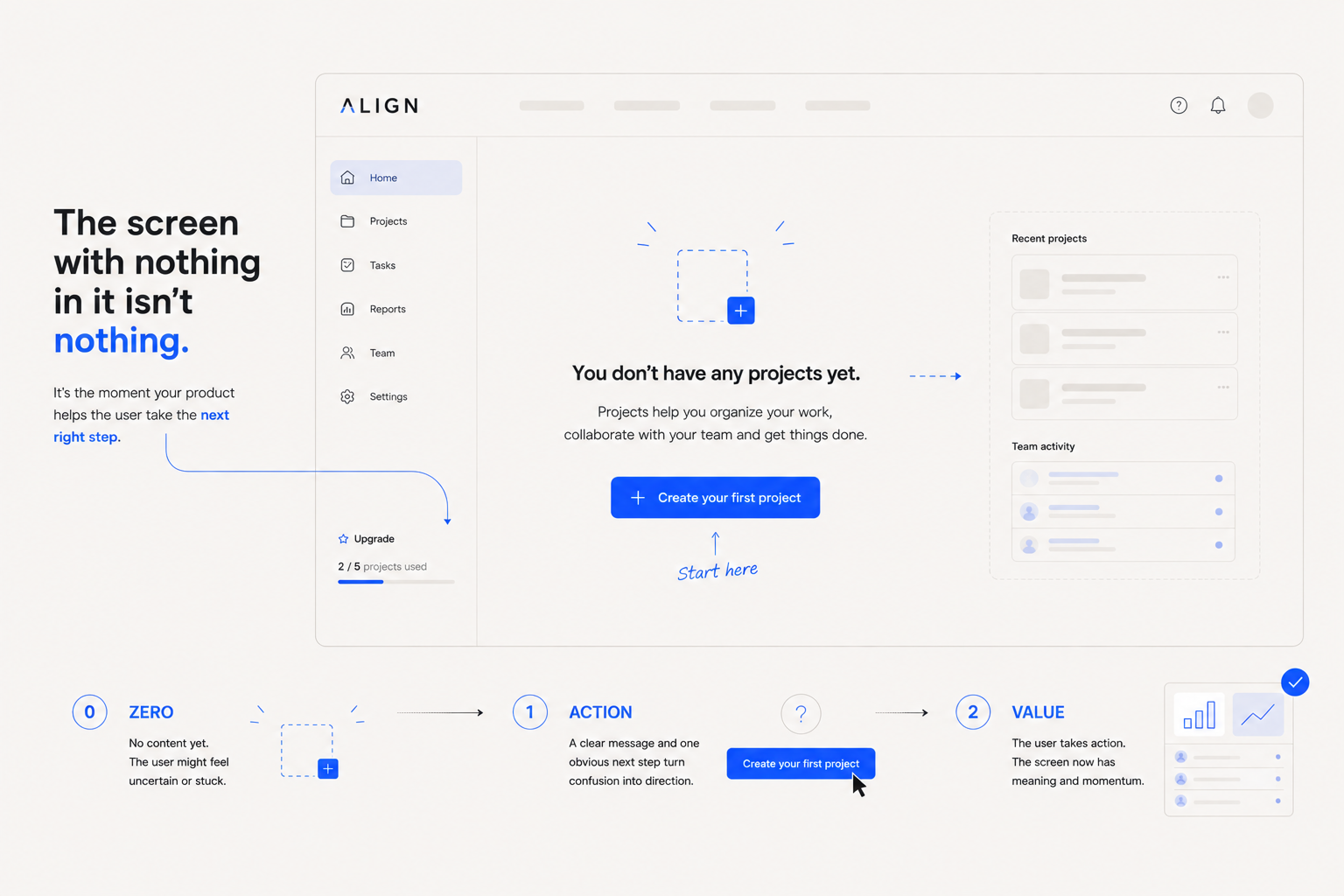
There’s a strange moment in almost every digital product.
You sign up.
You get through the onboarding.
You click into the dashboard.
And then…
Nothing.
No projects.
No messages.
No saved items.
No activity.
No data.
Just an empty box, an illustration, and some variation of:
“Nothing here yet.”
It’s easy to dismiss this as a temporary state.
After all, once the user starts using the product, the content will appear.
But that’s exactly why empty states are interesting.
The first time a user sees an empty screen is often the first time the product has to explain itself without relying on existing content.
And many products are surprisingly bad at that.
They spend months designing what the interface looks like when everything is populated, then treat the version that users see on day one as an afterthought.
That’s backwards.
An empty state isn’t an absence of experience.
It is an experience.
Empty doesn’t mean nothing is happening
Consider a project-management app.
A new user opens “Projects.”
There are no projects yet.
The interface technically has nothing to display.
But from the user’s perspective, several questions immediately appear:
- Is this where I create a project?
- Did I set something up incorrectly?
- Should I invite someone first?
- Is this feature available on my plan?
- What happens if I create one?
- What am I supposed to do next?
A completely blank screen answers none of them.
That’s the problem.
The system knows exactly why the screen is empty.
The user doesn’t.
Nielsen Norman Group identifies three particularly useful jobs for empty states: communicating system status, providing learning cues, and creating direct pathways toward important tasks.
That makes the empty state much more than a placeholder.
It’s a small piece of product education.
There are different kinds of “empty”
One of the easiest mistakes is treating every empty state as the same problem.
It isn’t.
A first-time user seeing an empty dashboard is experiencing something completely different from an experienced user searching for something that doesn’t exist.
Consider these four situations.
01 — Nothing exists yet
The user hasn’t created anything.
Example:
No projects yet.
The product needs to help the user create their first one.
02 — Nothing exists because the user hasn’t completed a setup
The content is dependent on another action.
Example:
Connect your calendar to see upcoming events.
The empty state needs to explain the dependency.
03 — Nothing exists because the user’s search or filter returned no results
The product contains data.
The current query simply didn’t find any.
Example:
No projects match “website.”
That’s not an onboarding problem.
It’s a search problem.
The user may need to change their query, remove a filter, or understand why nothing matched.
04 — Nothing exists because the system is still working
This is completely different again.
If content is loading, saying:
No projects yet.
isn’t merely unhelpful.
It’s wrong.
NN/G specifically warns against misleading empty-state messages appearing while content is still loading because users may assume there is genuinely no data and abandon the task before the real content appears.
So before writing the copy, ask a more basic question:
Why is this screen empty?
You can’t design the right empty state until you know the answer.
The illustration isn’t the empty state
This is where product design often gets superficial.
A designer creates a beautiful illustration.
Maybe it’s a little folder.
Maybe it’s a smiling character.
Maybe it’s a collection of colourful geometric shapes.
Then underneath:
“It’s empty here.”
And finally:
[Create something]
It looks finished.
But it hasn’t necessarily solved anything.
The illustration can make an empty state feel friendlier, but it doesn’t explain the product’s state.
It doesn’t necessarily teach anything.
It doesn’t necessarily reduce uncertainty.
And it doesn’t tell the user why they should take the next action.
Decoration can support direction. It can’t replace it.
This is especially important in products where users are unfamiliar with the terminology or workflow.
If the user has never created a workspace before, telling them:
“Create your first workspace”
isn’t always enough.
What does a workspace do?
Why would they create one?
What will happen afterwards?
Sometimes one additional sentence is more valuable than an elaborate illustration.
Good empty states answer three questions
A useful way to think about empty-state UX is to ask whether the screen answers three things:
What happened?
Explain the current state.
No projects yet.
Simple.
Why does it matter?
Give the user enough context to understand what this area is for.
Projects help you organise your work, files and collaborators in one place.
Now the empty screen is teaching.
What should I do next?
Give the user a clear action.
Create a project
Now there is a path.
Put together, the experience becomes:
State → Context → Action
Not every empty state needs all three equally.
But most good ones provide some version of this sequence.
The CTA should follow the user’s situation
Here’s another common mistake.
Designers hear “empty state” and immediately add a CTA.
But the right CTA depends on why the state is empty.
Imagine a file-management product.
First-time state
No files yet
Upload your first file to start building your workspace.
Upload file
Makes sense.
Now imagine the user searched for:
“invoice”
and got nothing.
The same CTA would be strange.
A better state might be:
No files found
Try a different search term or remove some filters.
Clear filters
Same empty interface.
Completely different problem.
This is why component libraries increasingly distinguish between different empty-state variants. For example, the Octopus Design System currently separates onboarding empty states from “no results” states and documents different contexts for each.
The lesson is simple:
Don’t design an empty state. Design the reason for the emptiness.
Your empty state can become part of onboarding
Here’s where things get more interesting.
Traditional onboarding often looks like this:
Welcome!
Here’s feature one.
Here’s feature two.
Here’s feature three.
Here’s a tour of your dashboard.
Then the tutorial disappears.
The user is left alone.
Contextual empty states offer another approach.
Instead of explaining everything upfront, you can teach the product where the user actually needs the information.
Imagine a design tool where the “Components” panel is empty.
Instead of:
No components.
You could say:
Components help you reuse common interface elements across your designs.
Create one from an existing layer to get started.
Now the user learns the feature exactly where they encounter it.
NN/G describes these contextual learning cues as particularly useful because users can apply the information immediately rather than trying to remember something from a generic tutorial shown earlier.
That’s a much better relationship between education and action.
Teach when the information becomes relevant.
Not simply when the user first signs up.
The first empty state and the fifth empty state shouldn’t necessarily behave the same
This is a subtle but important distinction.
A brand-new user needs orientation.
An experienced user usually doesn’t.
Imagine a user creates their first five projects.
The first time they see:
No projects yet
Create your first project to get started.
That’s useful.
The sixth time?
Probably not.
At that point, the user already understands what a project is.
They may simply have no projects in a particular workspace.
The interface should respect that knowledge.
This is one reason product design can’t be reduced to designing isolated components.
The same component can mean different things depending on where the user is in their relationship with the product.
The empty state is part of a journey, not a static screen.
Sometimes the best empty state isn’t empty at all
There’s another option worth considering:
Show something.
If a new user opens a product and has no data, you might be able to provide:
- Sample content
- Templates
- Demo projects
- Example reports
- Suggested actions
- Starter configurations
This can be especially useful when the product is difficult to understand without seeing the finished result.
Think about the difference between:
No dashboards yet.
and:
Start with a template
Sales overview
Marketing performance
Product analytics
The second option doesn’t merely tell the user what to do.
It shows them what the product can become.
That’s powerful because examples can teach possibilities that instructions struggle to communicate.
But this isn’t universally better.
Sample content can also create confusion if users mistake it for their own data.
Again, the right solution depends on the situation.
Don’t turn every empty state into a sales pitch
There’s a temptation here.
If empty states are valuable, why not use them to promote features?
Because the user isn’t asking to be marketed to.
They’re trying to figure something out.
Imagine opening a dashboard and seeing:
Your dashboard is empty.
Upgrade to Pro to unlock advanced analytics.
Technically, that’s a CTA.
Experientially, it’s a dead end.
The product has identified a moment of uncertainty and used it to sell something.
That’s not necessarily good UX.
The first responsibility of an empty state is to help the user understand the situation and move forward.
Solve the user’s immediate problem before introducing another one.
A practical framework for designing empty states
Before shipping one, ask these six questions.
01 — Why is it empty?
First use?
No results?
No permissions?
No data?
Loading?
An error?
If you can’t answer this, you’re not ready to write the empty-state copy.
02 — What does the user already know?
A new user needs more context.
An experienced user may only need a short instruction.
03 — What is the most useful next action?
Not every possible action.
The most useful one.
If there are five buttons, the empty state probably hasn’t made the decision clear enough.
04 — Can the user understand the value?
Don’t just tell them what to click.
Give them a reason to care.
05 — Is the message accurate?
“Nothing here yet” is very different from “Nothing matched your search.”
The wording should reflect the actual system state.
06 — Can the screen teach something?
If the feature is unfamiliar, use the opportunity.
The best empty states don’t just remove uncertainty.
They create understanding.
The real design challenge is the moment before the data arrives
Product teams naturally obsess over populated states.
The dashboard with beautiful charts.
The project list filled with work.
The inbox with messages.
The analytics page with numbers.
Those are the screens that appear in design presentations.
But products don’t begin there.
They begin at zero.
And zero is where the user has the least context.
That’s why empty states deserve more attention than their visual size suggests.
They sit at the intersection of:
UX writing.
Product logic.
Onboarding.
Information architecture.
Interaction design.
A good empty state isn’t just a nice component.
It’s the product explaining itself at exactly the moment explanation is needed.
Design for the state, not just the screen
The bigger lesson goes beyond empty states.
Interfaces aren’t static pictures.
They’re systems that change depending on what the user has done, what they haven’t done, what the system knows, and what happens next.
A dashboard isn’t one design.
It’s:
- First visit
- Partially configured
- Fully populated
- Filtered
- Loading
- Failed
- Offline
- No results
- Returning user
Each state tells a different story.
When designers only design the “happy path,” they’re designing the product that exists in the presentation—not necessarily the product that users experience.
That’s where the seemingly small details start becoming important.
The blank dashboard.
The first project.
The failed search.
The missing permission.
The loading message.
The confirmation after an action.
These are not edge cases to clean up at the end.
They’re part of the product.
And sometimes, the screen with the least content has the most work to do.
Because when there’s nothing there, the interface has one job:
make the next thing obvious.
That’s good product design.
Not filling the space.
Not decorating the absence.
Just helping the user understand what happens next.
Looking to make a digital experience clearer?
